An Overview Of Polinode
If you haven’t used Polinode before - it’s a tool for mapping, visualizing and analysing networks in the browser. With Polinode you can either create Networks, Surveys or both. Polinode Networks allow you to upload any type of connected data to the cloud and then visualize and analyze this data directly from your browser. The source of the data can literally be anything including emails, 360 degree performance reviews, enterprise social networks, social media, etc.

Polinode Surveys allow you to collect network data using our built-in relationship-based survey tool. For example, you can ask questions such as “Who do you work with often?” or “Who do you go to for advice?”. You can then visualize and analyze this network data in one integrated and highly flexible solution. Applications include change management, identifying emerging talent, M&A integration and improving workplace layouts. This is what we call the ‘Survey’ functionality and in summary it is most often used for organizational network analysis (or ONA for short).
Two New Features
We are excited to announce that two new powerful features have just gone live! A handful of users have been testing these features over the last few weeks and the feedback has been very positive so we wanted to share them with the broader community as soon as possible. In summary, these new features are:
- Identify Influencers: We have added the ability to identify those individuals or nodes in the network that together maximise the coverage over the entire network; and
- Collaboration Matrices: We have added a new type of report called a Collaboration Matrix that summarises the interaction between different groups in a network.
Identify Influencers
In Polinode, we’ve always included the ability to identify the most central individuals or nodes in a network through a number of built-in metrics including Total Degree, In Degree, Out Degree as well as PageRank and Eigenvector centrality to name a few of the more popular measures. There is a different but closely related question that frequently comes up though and that is this - how can we identify a handful of individuals that reach the maximum number of individuals in the network? From an organisational network analysis perspective this question most commonly comes up from a communications or change management perspective. An increasingly common use of ONA is to identify what are called “influencers” in the organisation. This group may be used for a specific change management initiative or they may be used in order to improve the bidirectional communication between the Senior Executive team and the rest of the organisation.
A relatively naive approach would be to look at the top X individuals with the largest number of incoming connections (i.e the largest In Degree). Suppose though that there are two individuals in the network whose individual networks overlap each other to a large extent? In order to maximise the coverage of the network it intuitively makes sense that you may choose to select only one of these individuals. The new Identify Influencers metric makes it easy to find the answer to this question!
How does it work? Well, for most networks it’s not really computationally feasible to find an exact answer for the set of individual nodes that maximise coverage, rather we use a heuristic algorithm that tends to perform fairly well. It effectively starts with the node with the largest number of connections and then iterates through the rest of the network and at each step we add the node that is connected to the most nodes that aren’t currently included in the set of connected nodes.
Let’s take a look at an example and talk through a few of the available options. If we click on Metrics within the Explore view we will see the below (note: you can click on any image in this post to view a larger version).
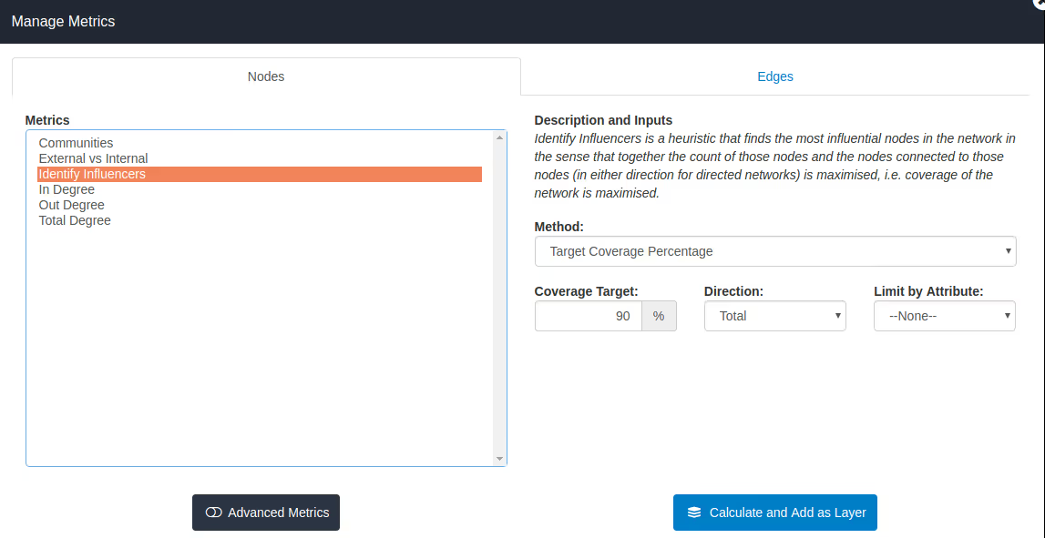
The first thing to note is that Identify Influencers is a Basic metric so is available to all users, including those on the Basic plan. You’ll also see a short description as to what we are calculating on the right hand side. Now, you will see that we are presented with two options for Method - Target Coverage Percentage and Identify Given Number of Nodes. The first option - Target Coverage Percentage - gives us the ability to specify the total percentage of the network that we would like to see covered, i.e. when combining the identified nodes together with all the nodes that they are connected to those nodes should include at least this percentage of the total nodes in the network. In the image above you will see this percentage is set to 90%, which is the default. If you select “Identify Given Number of Nodes” rather than “Target Coverage Percentage” you will have the ability to enter a number of nodes to identify and the algorithm will find up to that many nodes that maximise the percentage coverage for the network. In other words you either choose a percentage coverage and find the minimum number of nodes or you choose a number of nodes and solve for the maximum percentage coverage
The next option you will see is Direction and you have the ability to select either Total, In or Out for that option. If you select Total, which is the default, then the algorithm will take into account both incoming as well as outgoing edges when calculating coverage. As you would expect, if you select In then only incoming edges will be considered and, if you select Out, then only outgoing edges will be considered.
The final option is Limit by Attribute - this gives us the ability to only select nodes with certain attribute values. For example, suppose you want to identify only individual contributors and your network contains an attribute called “Level” which takes three values - “Executive”, “Manager” and “Individual Contributor”. Then, for Limit by Attribute you would select the Level attribute and will then see a selection box below with the three available attribute values from which you would select “Individual Contributor”. More than one of these available attribute values can be selected by holding down the control key. So we could limit our selection to say both Managers and Individual Contributors.
So, what does it look like when we actually calculate the new Identify Influencers metric? The network below displays Identify Influencers calculated for the Enron email network with a target coverage percentage of 90%.
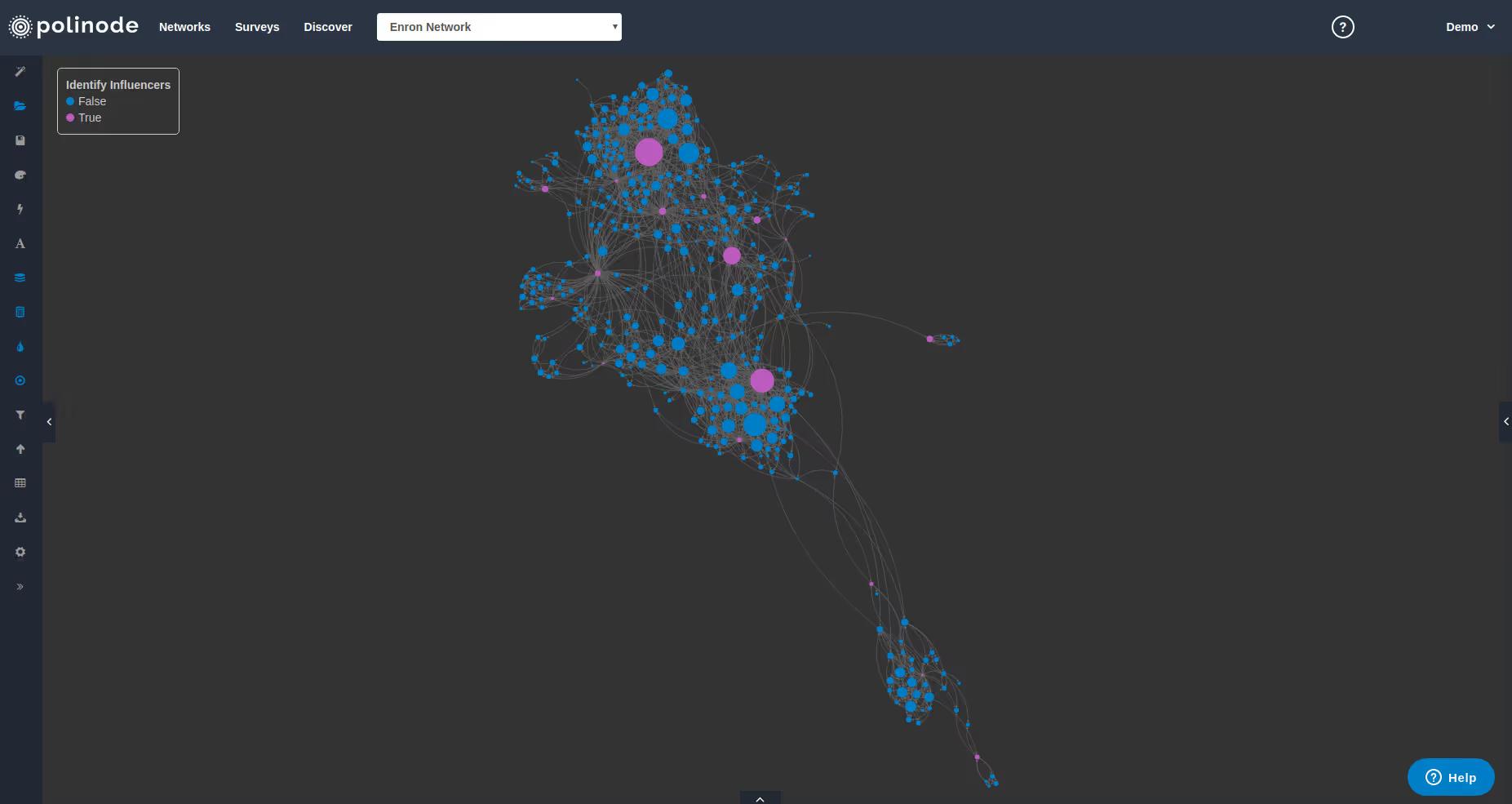
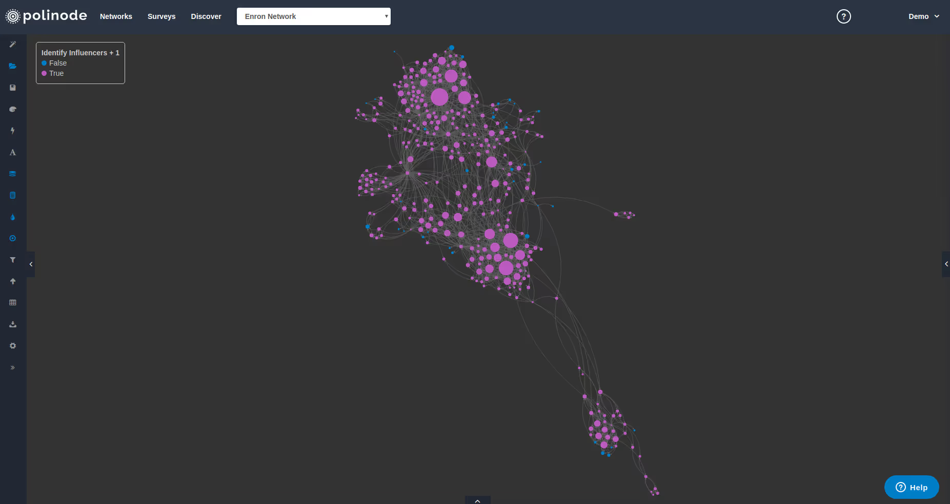
The pink nodes represent the identified influencers - there are 16 in total for this network. Once calculated, the metric also adds an attribute called “Identify Influencers + 1” for all nodes. This attribute is equal to True if the node is either an identified influencer or is connected to an identified influencer. Below we have colored the same network diagram by this attribute - there are now 329 pink nodes, which represents slightly over 90% of the total 365 nodes in the network.
Collaboration Matrices
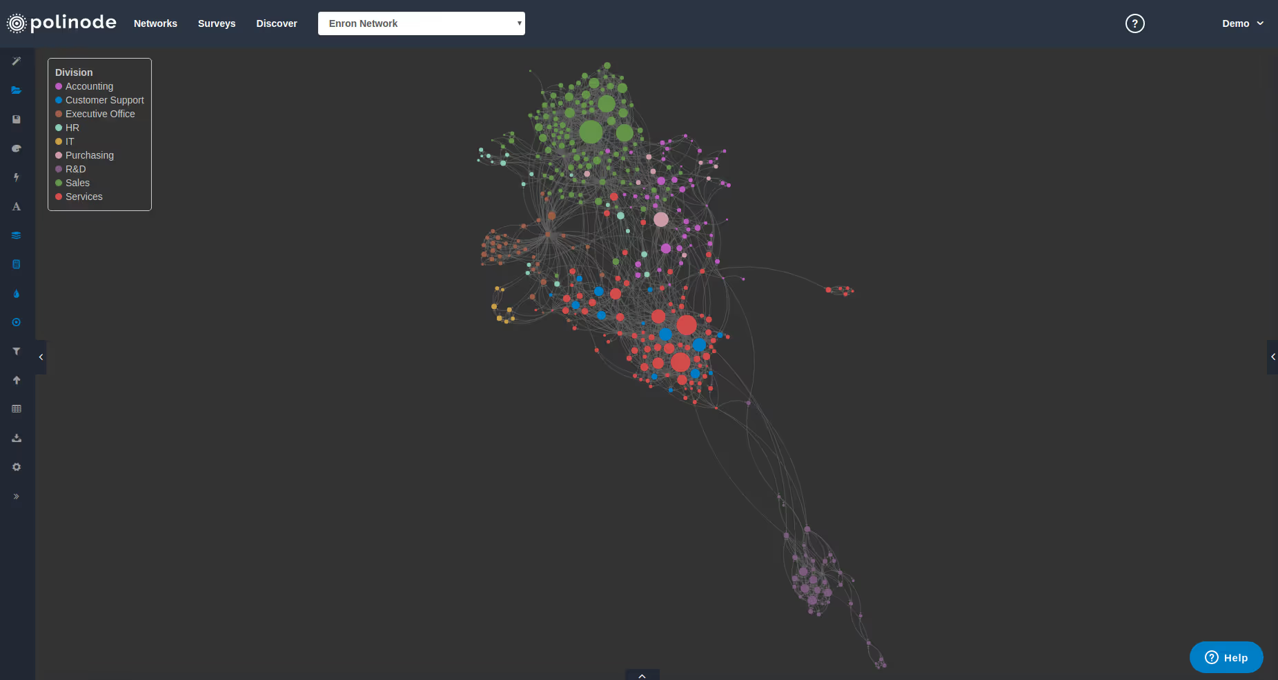
Today we’ve also added a powerful new report to Polinode that you can access from the Explore view by clicking on Network Reports and then Matrix Reports. It’s called a Collaboration Matrix and it provides a table that summarises the interactions between different groups in the network. To illustrate we have colored the network below by Division. Visually you can see how some divisions work more closely together - such as Services and Customer Support - and some are more isolated - such as R&D towards the bottom right.
The Collaboration Matrix helps support these kinds of insights with a numerical table as provided below. Here we have selected Division as the Attribute but you may select any categorical attribute in the network. The row headings then represent the Source of edges in directed networks (i.e. the “From”) and the column headings are the Target of edges (i.e. the “To”). So the interpretation of the 55.9% you see in the top left corner is that of all the outgoing edges from employees who work in the Accounting division, 55.9% are to other employees in the Accounting division. And the next number over is interpreted in a similar way - of all the outgoing edges from employees who work in the Accounting division, 2.4% are to Customer Support. These percentages sum to 100% across each row as you would expect. There is also an extra row at the bottom of the matrix - Relative Size. This row provides you with information on the relative size of each category in the attribute. So, the 14.0% you see for Accounting means that of the visible nodes in the network, 14.0% work in the Accounting division. It’s helpful to compare the percentages in each column to the relative size for that attribute below.
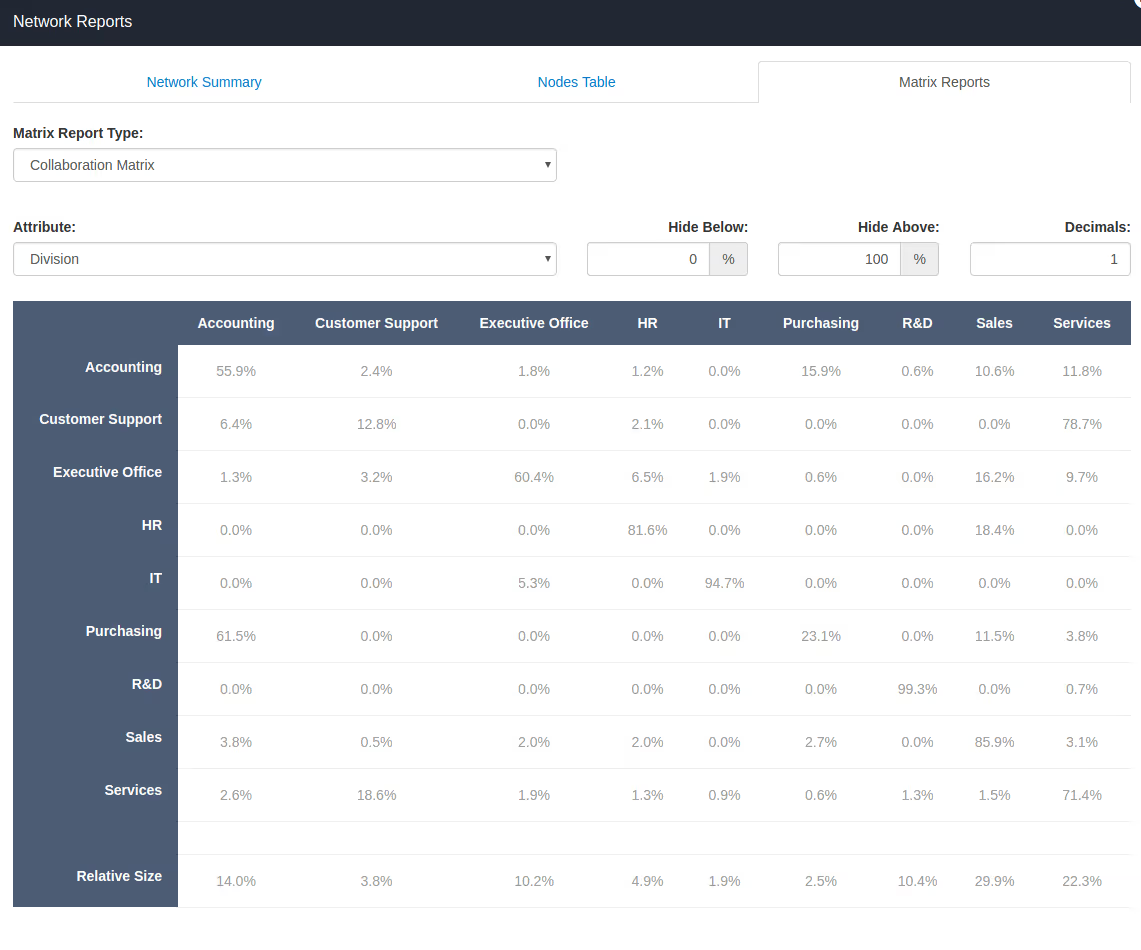
It's important to point out that, like all metrics and reports in Polinode, Collaboration Matrices are fully dynamic in Polinode in the sense that if you filter by an attribute (say filtering by Gender to examine the network of females in isolation) the Collaboration Matrix will automatically adjust to show the interactions for the visible network (i.e. only between females for the chosen attribute). One final point to note about Collaboration Matrices is that you can export them to Excel using the blue "Export Matrix" button that appears below the matrix. Once in Excel you can use conditional formatting in order to create a heatmap for the matrix.
Try it Now
If you already have a Polinode account you can login here and give these new features a go right now. If you haven’t created an account yet you can sign up for a free trial here!


.avif)


%20(2)_cropped_processed_by_imagy.png)

