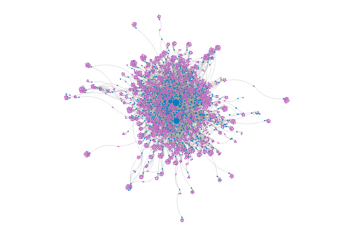
An Overview of Polinode
Before we talk about the two new layout algorithms that we just added let's briefly recap what Polinode is and what you can do with it. Polinode is a tool for mapping, visualizing and analysing networks in the browser. By networks we mean any kind of relationship data - Excel is about rows and columns and Polinode is about the visualisation and analysis of connected data. The source of the data you upload to Polinode can literally be anything including email communication, 360 degree performance reviews, enterprise social networks, social media, etc.
Polinode also has survey functionality built-in which allows you to collect network data. For example, you can ask questions such as “Who do you work with often?” or “Who do you go to for advice?”. You can then visualize and analyze this network data in one integrated and highly flexible solution. Applications are many and varied but include change management, identifying emerging talent, M&A integration and improving workplace layouts.
Announcing Two New Layout Algorithms
Polinode has always included a powerful Force Directed layout algorithm which is the default algorithm applied to layout nodes when visualizing them. Essentially, nodes that are relatively closely connected will be positioned relatively close together in space. A few months ago we added a second layout algorithm called a Hierarchical Layout. This provided a second layout option for small and medium size networks. Today we are announcing two more layout algorithms:
1. Distribute Nodes
Often when the Force Directed layout algorithm is run, especially on larger networks, some nodes will end up overlapping with other nodes. This makes a network more difficult to interact with. Now though, with the introduction of the Distribute Nodes layout algorithm, it’s relatively simple to remove all of this overlap. After running another layout algorithm just select the Distribute Nodes layout algorithm and run it - overlapping nodes will be moved apart. Advanced options also exist to add an additional margin between nodes and to create more space around larger nodes - you are free to experiment with these advanced settings until you achieve the layout that you are after.

2. Plot Nodes
With Polinode you have the ability to attach arbitrary data to each node - we call this adding attributes to nodes. For example, if nodes represent employees in a company, you can upload information such as the division those employees work in or their tenure at the company. Really any data that you want - either numerical or categorical. Of course, you've always been able to size nodes, color nodes and filter nodes by this data. Now though you can do one more very useful thing with this data - you can use it to position nodes. This is what the new Plot Nodes layout allows you to do - to select any numerical or categorical attribute value for the horizontal axis and any numerical or categorical attribute value for the vertical axis and position the nodes according to those attribute values. There are also a number of advanced options for this layout that give you further control over the positioning of the nodes.

To put it simply, Plot Nodes allows you to create both scatter plots and column charts using your nodes. Furthermore, since all calculated metrics are automatically added as attributes on nodes you can create scatter plots and column charts using calculated network metrics such as centrality or betweenness.
Getting Started!
So, those are the two new layout algorithms that we've just added. If Polinode sounds interesting to you then please feel free to sign-up here and get started yourself. And, of course, if you have any thoughts or ideas on the above feel free to add a comment below or you can get in touch with us either here or by sending an email to info@polinode.com.


%20(1)%20(1).avif)


%20(2)_cropped_processed_by_imagy.png)


